CASE STUDY
Designing SnackPop, a mobile app
for browsing and ordering movie theater snacks
June - July 2023
PROJECT OVERVIEW
Project title: SnackPop
My roles:
-
Project Lead
-
UX/UI Designer
-
UX Researcher
Tools: Figma
Deliverables:
-
Lo-fi mockups
-
Hi-fi prototype
-
Case study slide deck

THE VISION
My goal is for SnackPop to offer:
-
a visually engaging interface that’s easy to use
-
a fast and secure checkout process, and
-
convenient movie snack ordering for its users.
THE PROBLEM
-
Everyone knows that seeing a movie is best enjoyed with a side of buttery popcorn and an ice-cold soda.
-
What if you’re running late and don’t have time to wait in line at the concessions stand?
-
You’ll either miss parts of the movie or lose out on the best movie theater experience possible!
THE SOLUTION
-
SnackPop is a mobile app for all movie-goers on the go.
-
With SnackPop, users can order ahead, pay for their favorite movie snacks, and skip the concessions line.
-
Customers can place and pick up their orders at any participating movie theaters with this convenient ordering option.
WHO IS THE USER?
Alana is a young mother of two daughters who needs to be able to order movie theater snacks for her girls when they’re running late because her daughters love having snacks at the movies, and they don’t want to miss any of the film.
Kimi is a high school student who wants to go to the movies without spending too much money on snacks because she is trying to be more financially responsible.
George is a 73-year old retiree who needs a mobile app that can accommodate his physical needs because he struggles with dexterity and vision issues.


USABILITY RESEARCH
Research Questions
-
How long does it take for a user to browse and order movie snacks in the app?
-
What can we learn from the steps that users take to order movie snacks?
-
Are there any parts in the user flow/navigation process where users are getting stuck?
Moderated Usability Study
-
Participants: 3 males, 2 females (ages 28-74)
-
Users were asked to
perform tasks on the
low-fidelity prototype -
~15 minutes
-
New York, US
Usability Results

Users were surprised to see a map page to begin an order and unsure where to click to continue
Users were not sure where to click on the homepage to begin an order

Too many button presses to add multiple items to an order
"Back" button too far from "Add to Order" button
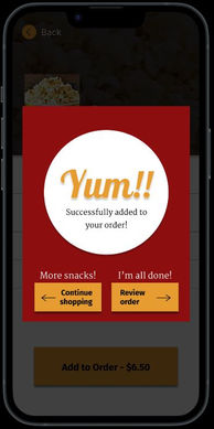
Users want more feedback after clicking buttons

Before & After


More obvious "Order" button on homepage
Clearer instructions on theater selection page
More feedback & easier to add multiple items to an order
DESIGNING FOR EQUITY
Accessibility Considerations
High-contrast color scheme
Speech-to-text options
Alternative text for images
Compatible with screen readers
Avoiding unnecessary text
App text available in various languages
More Convenient Ordering
-
Option to filter menu items for dietary needs (e.g., gluten-free, vegan, kosher)
-
Save "Favorite" and "Recent" theater locations and menu items for streamlined ordering
-
Rewards program to help customers save money and promote customer loyalty
CONCLUSIONS

Next Steps
-
As a graduate student in a Cognitive Psychology Ph.D. program, I have learned many transferable skills that can be useful in a UX Design.
-
Next, I look forward to putting my new knowledge of UX Design to work in a summer internship.
-
In a UX Design position, I plan to gain more experience in the field, specifically working towards designing a real product.

What I've learned
-
Enrolling in the Google UX Design Certificate course on Coursera was a great learning experience for me.
-
I now have a better understanding of:
-
the product development process
-
designing for the user
-
conducting usability studies and interpreting data,
iterating designs to accommodate the users’ needs, and -
keeping accessibility options in mind.
-


